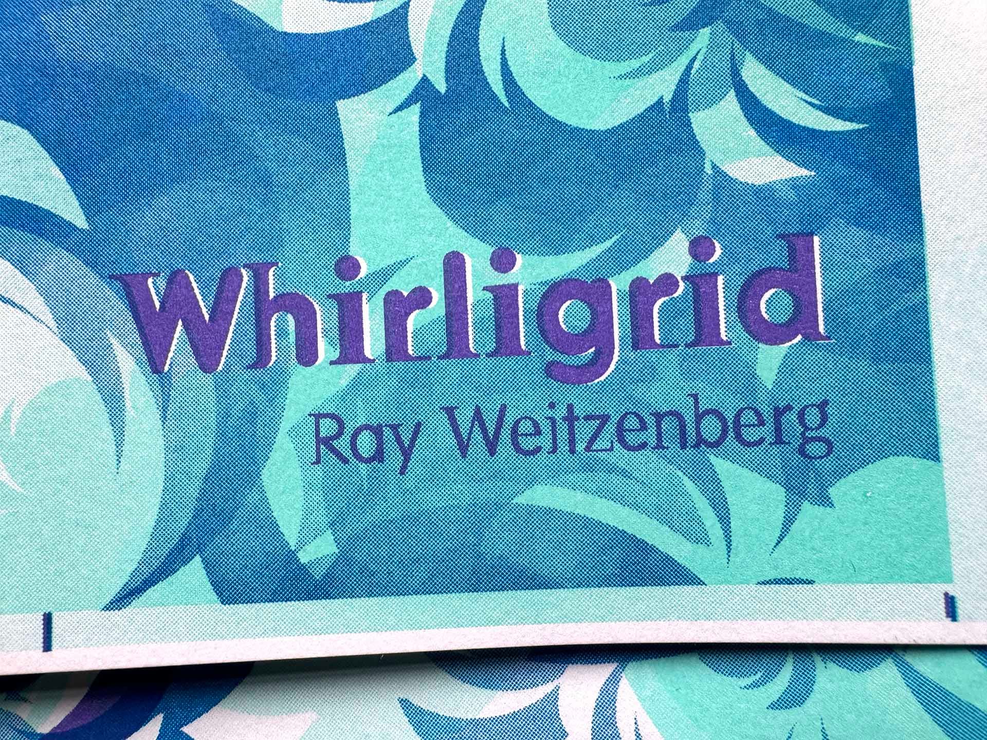
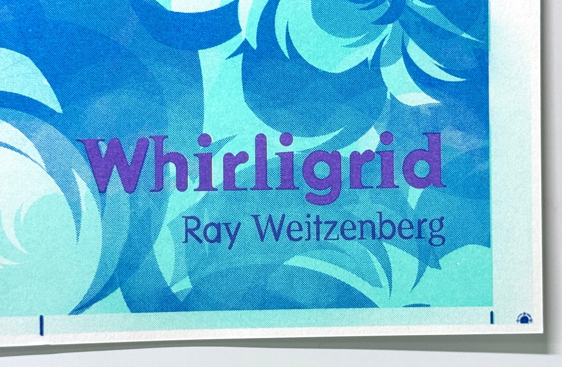
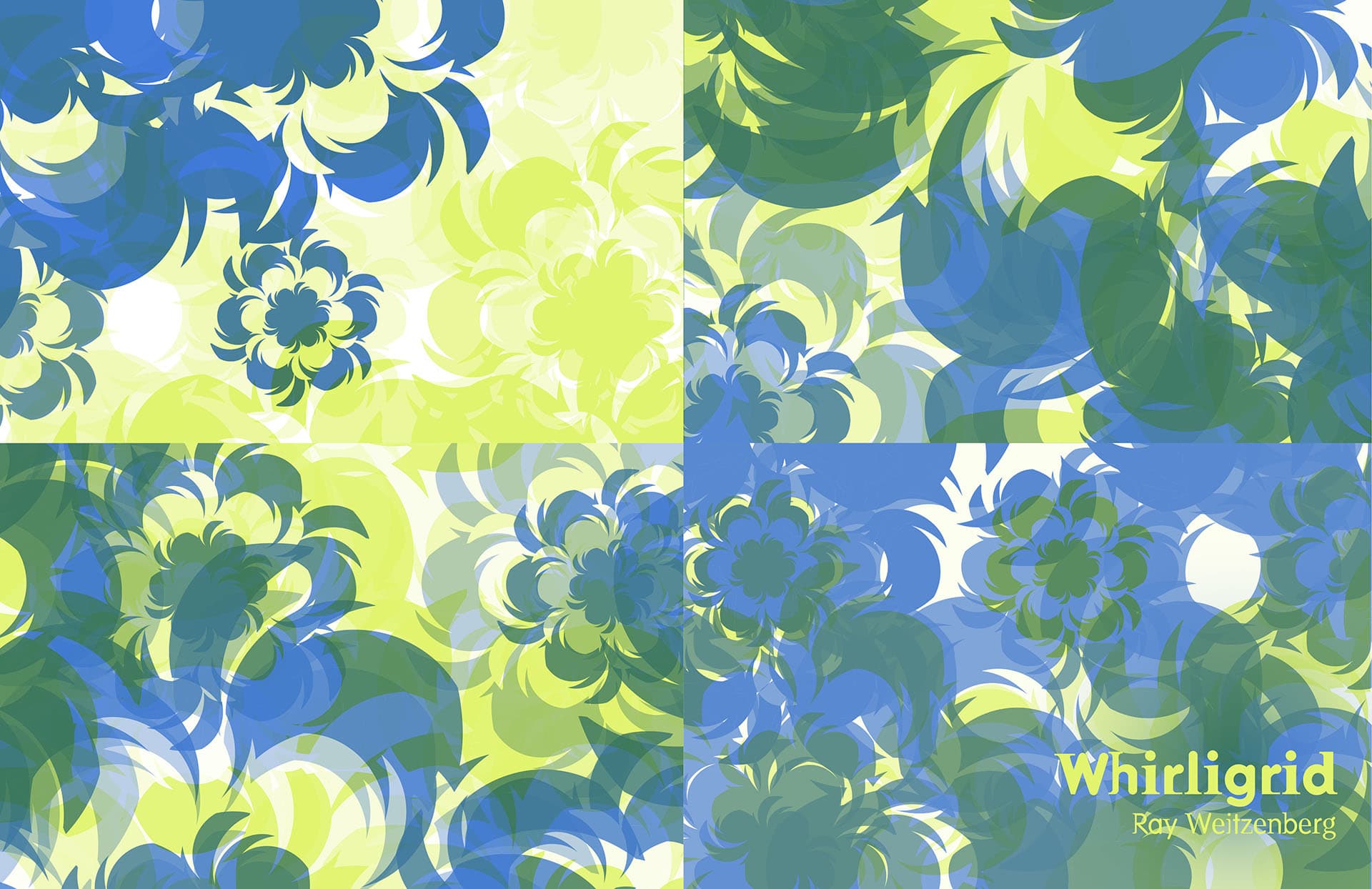
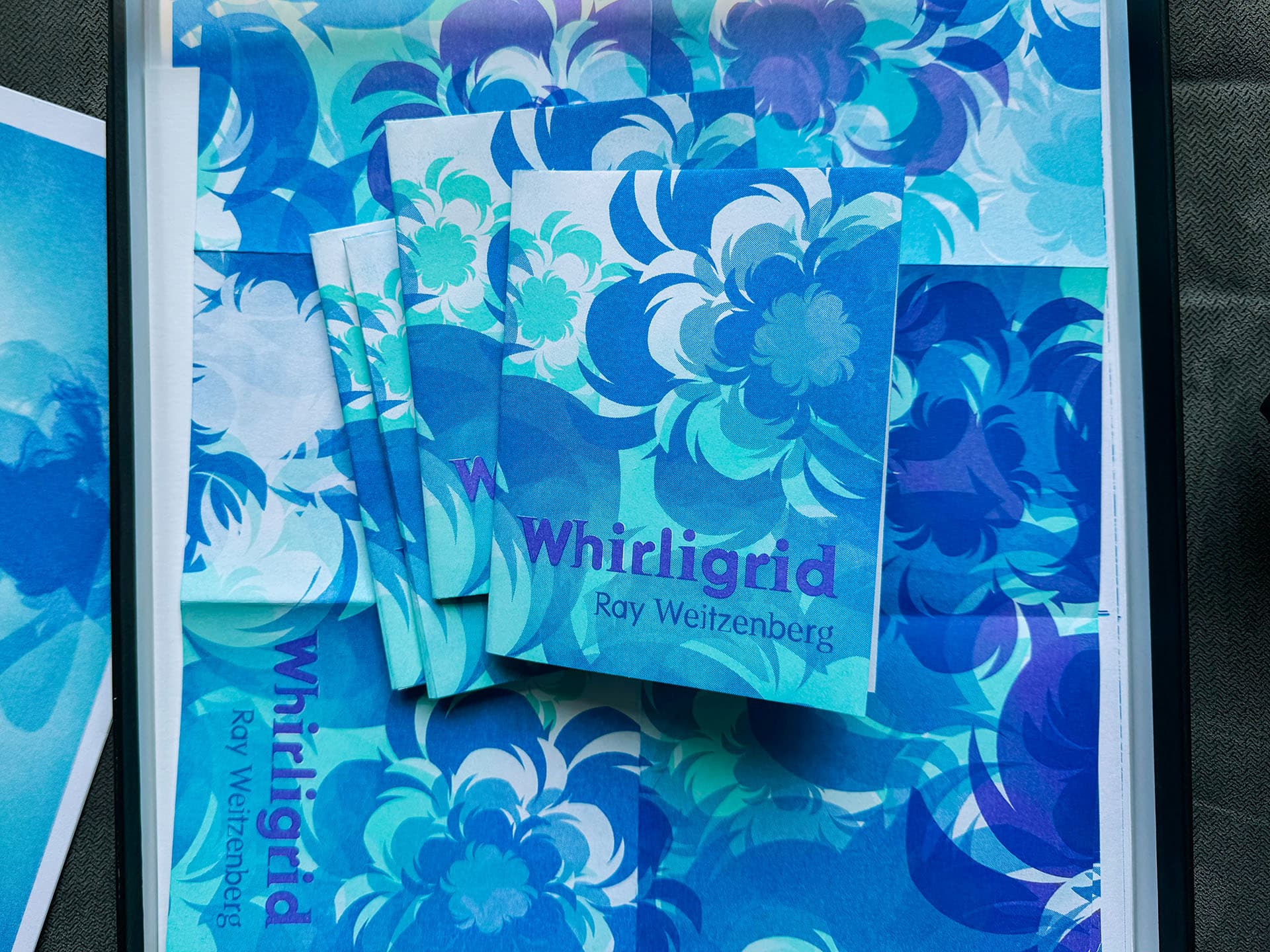
NYSee

Radar

ยท

Werk

ยท

Ray
Whirligig zine printed, including a few zines cut and folded

Whirligrid

2024

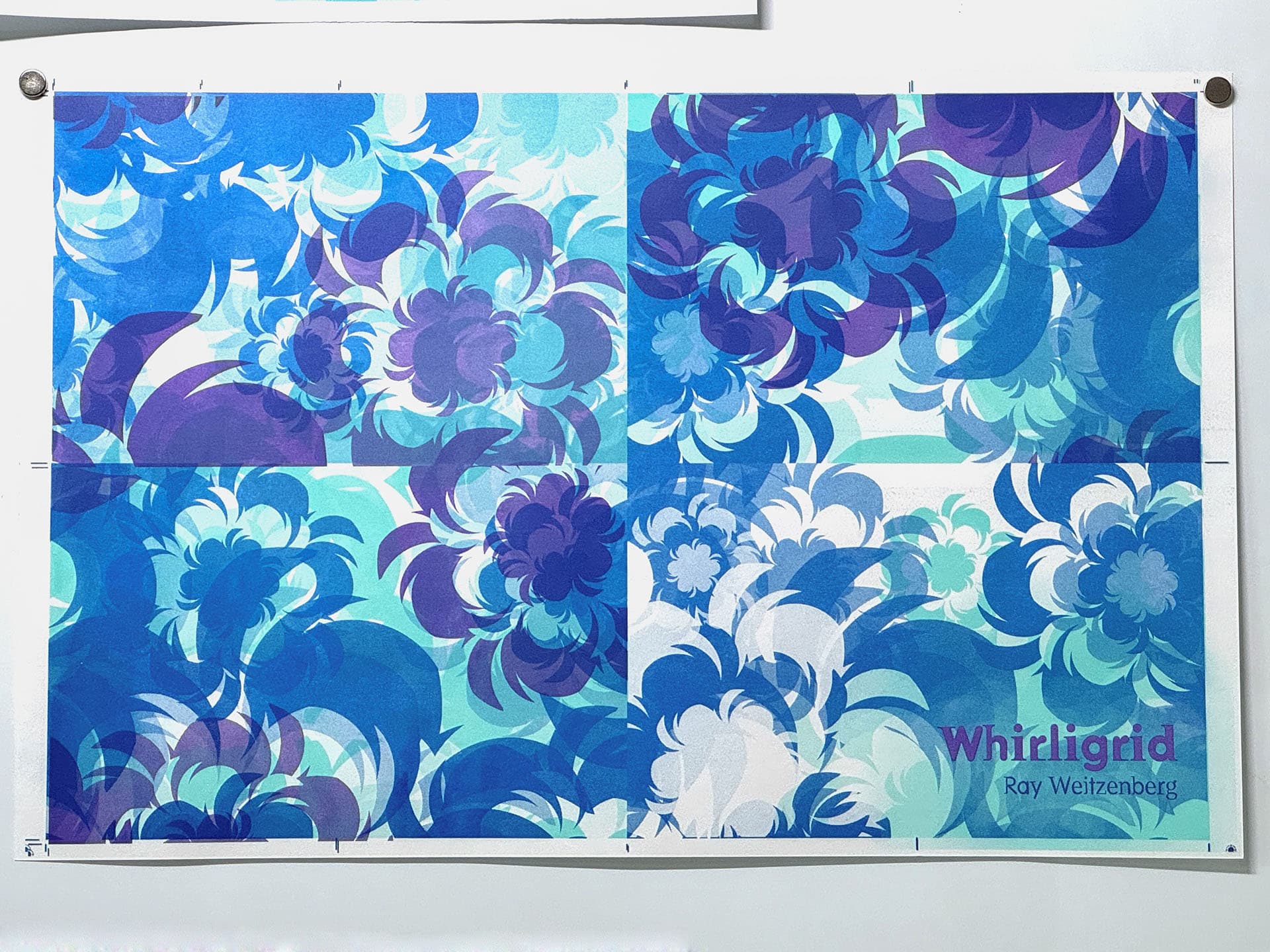
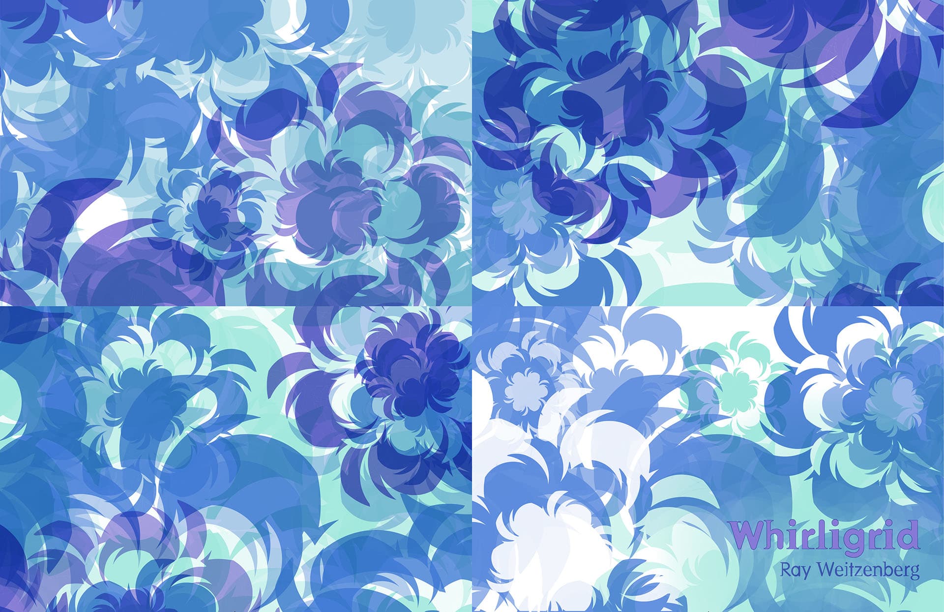
This is the one page zine I ran with for the first Risolab project.

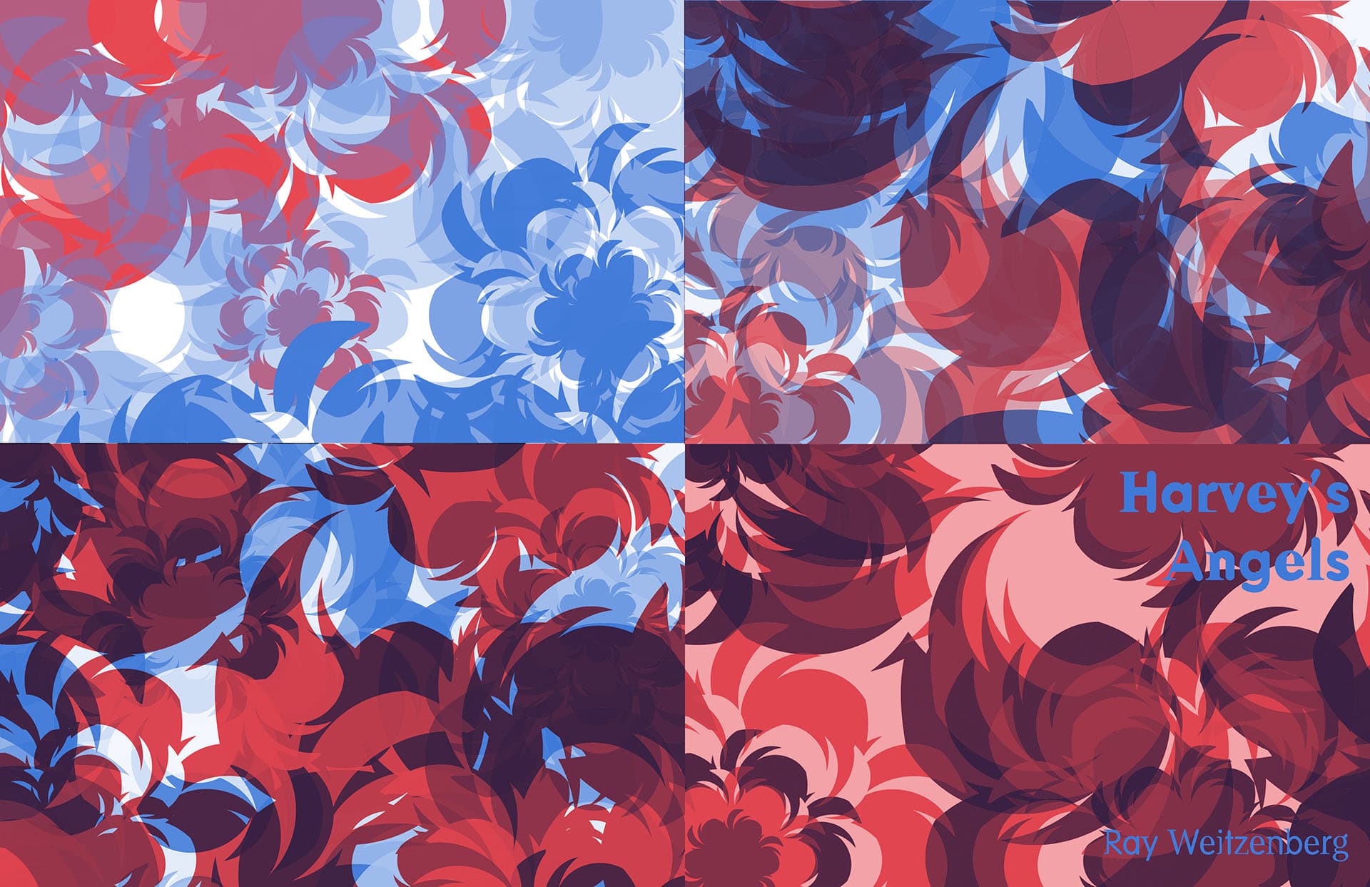
When it became clear Gossamer wasn't going to print, I backed out and leveraged some Illustrator files I've been wanting to use. The repeated shape is a single character from the Whirligrid font developed by Zuzana Licko.

One thing I like about working in Illustrator is that I can randomly apply colors to elements using the Recolor Artwork tool. I can load up a colorway and then just run and re-run until I find something I like.

Once settled on the resulting composition, I paste the vector elements into Photoshop, breaking each color's elements into their own layer for arrangement, further post, then on to print.

Tight shot of the front cover and title. Shows the layers out of alignment

Aligning Layers & Trapping

In order to print the text in it's full, uninturpted Violet color I created trapping by punching through the lower two layers before printing Violet last. Alignment was a bit of a challenge, but I got several to print well.

Directly above you can see that the final, Violet, layer was still a bit off. Further tweaking within the Riso allowed me to achieve ๐Ÿ‘‡ this dude.

Tight shot of the front cover and title. Shows the layers in perfect alignment

Success

The edges of the text are a bit saturated. This is because when in creating the trapping, one typically shrinks the selection that's cut by a couple pixels, thereby allowing the element to entirely fill and cover the lower, earlier layers.

Printed spread on a wall prior to trimming and folding

Printed

Printed, and before trimming and folding

Pretty happy with this, though you can see from the bottom left of the sheet that the layers aren't quite in perfect alignment. I'm good with this.

design layout which went to print. this saved from the working photoshop file

Print File

Capture of the PSD I used to print the sheet just above

Color study of the design layout which went to print. Here I'm using lime and cornflower blue

Color Study

I did a number of iterations on color as well as changing the ordering of the layers.

Much earlier iteration of the design. Here I'm using a lot of reds and blues

Older Iteration

This is a version I was experimenting with early in the process.

I'm not sure what I was doing that produced such saturated reds. This wouldn't have been reflected the same way when printed, so I backed out and reworked the file in the directions above.

A hint to what's behind the curtain